Ah, ok, it should be working ok on your screen now, if it doesn't just hit refresh couple of times or let me know.
The web app is designed to be used on mobile phone browsers (portrait and narrow) and only in full screen (when added to the phone's home screen) so there is no guarantee that the interface will look correctly in desktop browsers and it can break sometimes.
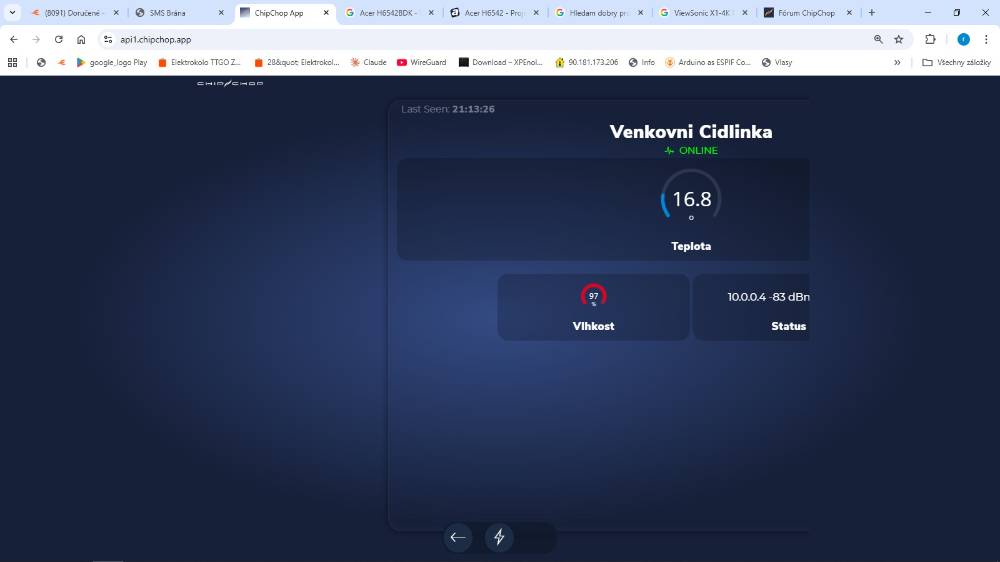
I am on a Mac and interestingly in Safari it works fine but I do get the same as you in Chrome, no issues on Android or iOS.
Anyway, I've found what the issue was through Chrome so it's sorted now.
Personally for desktop viewing I use the Dev Console (I have a lot of devices so it's easier) but maybe I should make something?
Here's is a suggestion, try the instructions below and it will maybe give you a better experience on the desktop:
This is a way to do it in Chrome/Safari don't know about other browsers:
1. open Chrome and go to https://api1.chipchop.app (or whatever is the app url for your account)
2. once opened add the page to the bookmarks
3. open the side panel to view all bookmarks and right click on the newly added bookmark and select "edit"
4. replace the URL with this
javascript:window.open('https://api1.chipchop.app','420:780','innerWidth=420,innerHeight=780,top=100,left=800,location=no, menubar=no, toolbar=no,titlebar=no,scrollbars=no');
You can adjust the actual url, size and position variables to whatever suits you. Try it first and then just keep tweaking the code until you are happy
5. save it and now click on the bookmark, this should launch the web app in a minimal window and sized more like a mobile phone screen (like a popup widget)
If nothing happens and the screen doesn't open you may have to allow popups in the browser settings or check that the code is correctly formatted
Let me know how it goes
G